Appearance & branding
What it's for
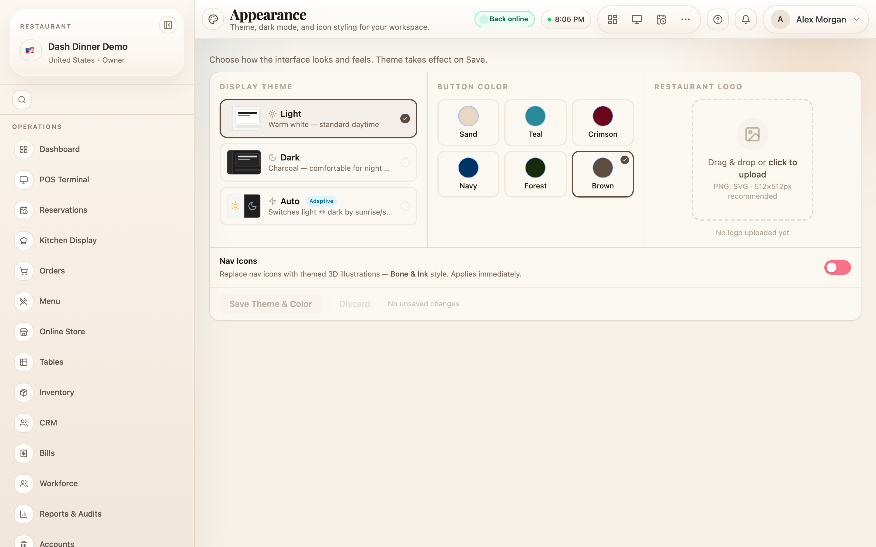
Appearance controls how DashDinner looks for your team — light or dark theme, the accent colour used on buttons, and your restaurant logo. The accent colour is yours to choose, and it carries through the whole app.
Where to find it
Choose Settings, then Appearance (route
/settings/appearance).
Display theme
Under Display Theme, pick one:
- Light — warm white, for daytime.
- Dark — charcoal, easier on the eyes for night shifts.
- Auto — switches light ↔ dark by sunrise and sunset.
Button colour (your accent)
Under Button Color, choose the accent used on primary buttons and active controls across DashDinner. Pick from the swatches — for example Brown (the default), Teal, Navy, Forest, or Crimson. In Auto theme you set a Day (Light) accent and a Night (Dark) accent separately.
Restaurant logo
Under Restaurant Logo, drag and drop or click to upload your logo (PNG or SVG, 512×512px recommended). The logo has its own Save Logo button, which appears once a file is staged.
Save
Theme and accent colour are staged and take effect on Save — choose Save Theme & Color (or Discard). The logo saves with its own button, and the themed nav-icons switch applies immediately.
Worked example
Match the app to your brand. Set Display Theme to Auto so it follows the time of day, choose a Teal Button Color to match your signage, upload your Restaurant Logo and choose Save Logo, then choose Save Theme & Color. Every primary button across DashDinner now uses your teal.
Tips & things to watch
- ✅ Pick an accent that reads clearly on buttons in both light and dark.
- ✅ Auto theme is a nice default for venues open day into night.
- ⚠️ Theme and colour apply on Save — the logo and nav-icons save separately, so use each save control.